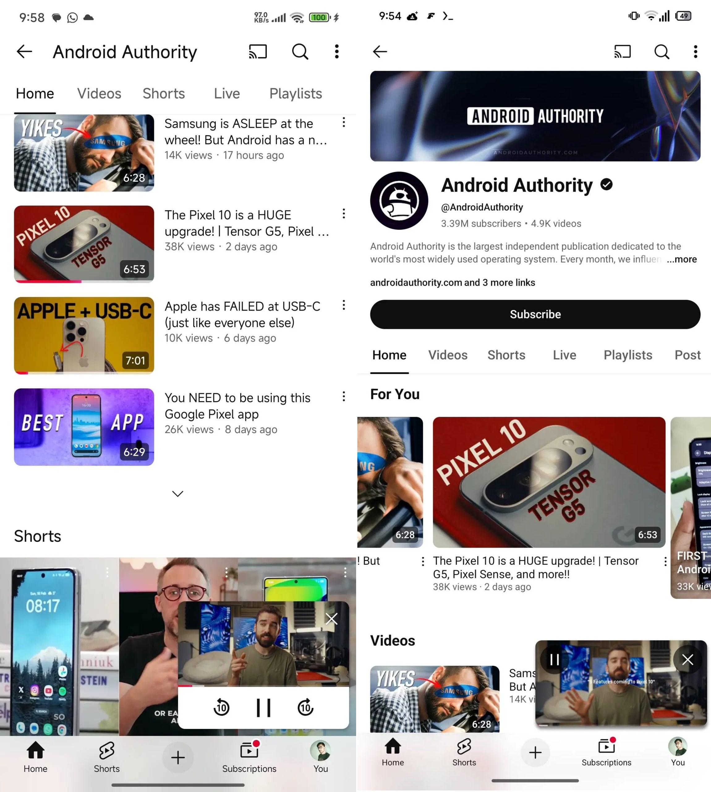

Last year, YouTube introduced a new mini-player design for Android devices, which was met with mixed reviews. The larger size of this mini-player was particularly criticized for occupying more screen space than users preferred. Responding to the feedback, YouTube is now set to unveil another redesign of the mini-player.
A Shift to a More Streamlined and Compact Layout
The upcoming design, visible in the 20.18.32 beta version of the YouTube app, removes the white bar with control buttons at the bottom of the small player. This change marks a transition to a more streamlined and space-efficient layout. Consequently, the forward and rewind buttons are no longer present; however, the pause and close buttons are now positioned above the video. Users can still enlarge the new mini-player using a simple finger gesture or by double-clicking, similar to the previous version. Additionally, the new design allows users to skip advertisements seamlessly.

The latest iteration of the YouTube mini-player is undoubtedly an enhancement over its predecessor, primarily due to the absence of the white bar at the bottom. Despite this, many users still favor the older design with the ribbon. What do you think of the changes?
SİGORTA
Az önceSİGORTA
23 saat önceSİGORTA
2 gün önceBİLGİ
4 gün önceSİGORTA
5 gün önceSİGORTA
8 gün önceSİGORTA
13 gün önceSİGORTA
15 gün önceSİGORTA
15 gün önceSİGORTA
16 gün önce 1
DJI Mini 5: A Leap Forward in Drone Technology
20189 kez okundu
 2
xAI’s Grok Chatbot Introduces Memory Feature to Rival ChatGPT and Google Gemini
14201 kez okundu
 3
7 Essential Foods for Optimal Brain Health
13045 kez okundu
 4
Elon Musk’s Father: “Admiring Putin is Only Natural”
12900 kez okundu
 5
Minnesota’s Proposed Lifeline Auto Insurance Program
10763 kez okundu
Sigorta Güncel Sigorta Şikayet Güvence Haber Hasar Onarım Insurance News Ajans Sigorta Sigorta Kampanya Sigorta Ajansı Sigorta Sondakika Insurance News